
Deliver AI in a widget that fits your product.
Choose the conversational engine, restrict allowed websites, and tune every visible part of the embedded chat experience with live feedback.
A widget targets one Agent, Workflow, or RAG and exposes presentation controls as standard colors and CSS-compatible values.
Overview
Configure behavior and presentation together
Widget settings combine routing, origin security, copy, colors, typography, controls, and launcher appearance. Every design change is reflected in the preview without saving.
Choose the AI resource that will receive visitor conversations.
Match the host product with color, type, border, and shadow controls.
Inspect the chat window and floating launcher as values change.
Section 01
Widget Identity & Conversational Target
Define where the widget can run, what visitors see first, and which AI resource handles their messages.
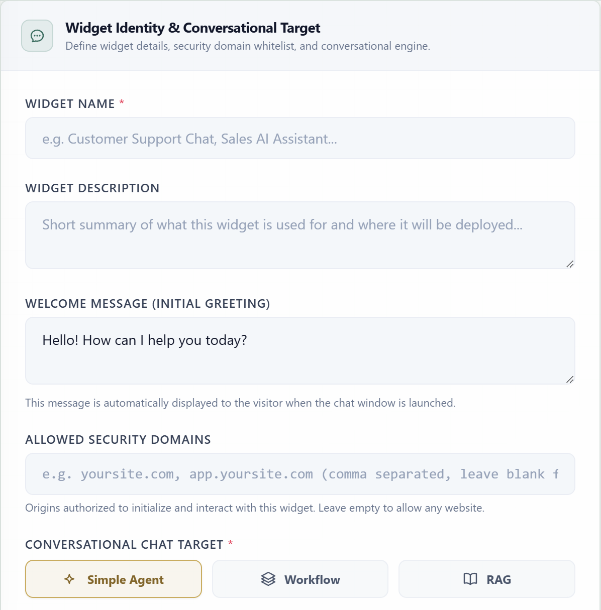
Widget NameRequiredThe internal display name used in the Widgets directory.
DescriptionOptionalSummarizes the widget purpose and where it will be deployed.
Welcome MessageOptionalThe first message displayed automatically when a visitor opens the chat.
Allowed DomainsOptionalA comma-separated origin allowlist authorized to initialize and interact with the widget.
Chat TargetRequiredSelects whether conversations run through one Agent, Workflow, or RAG.
Target ResourceConditionalThe specific saved Agent, Workflow, or RAG that receives visitor messages.
Runs messages directly through a selected autonomous agent.
Runs the selected multi-agent orchestrator and returns its final output.
Queries a selected knowledge base for grounded retrieval or synthesized answers.
Section 02
Header & Floating Launcher Style
Style the widget's top bar and the floating button visitors use to open it. Color controls pair a visual swatch with an editable hexadecimal value.
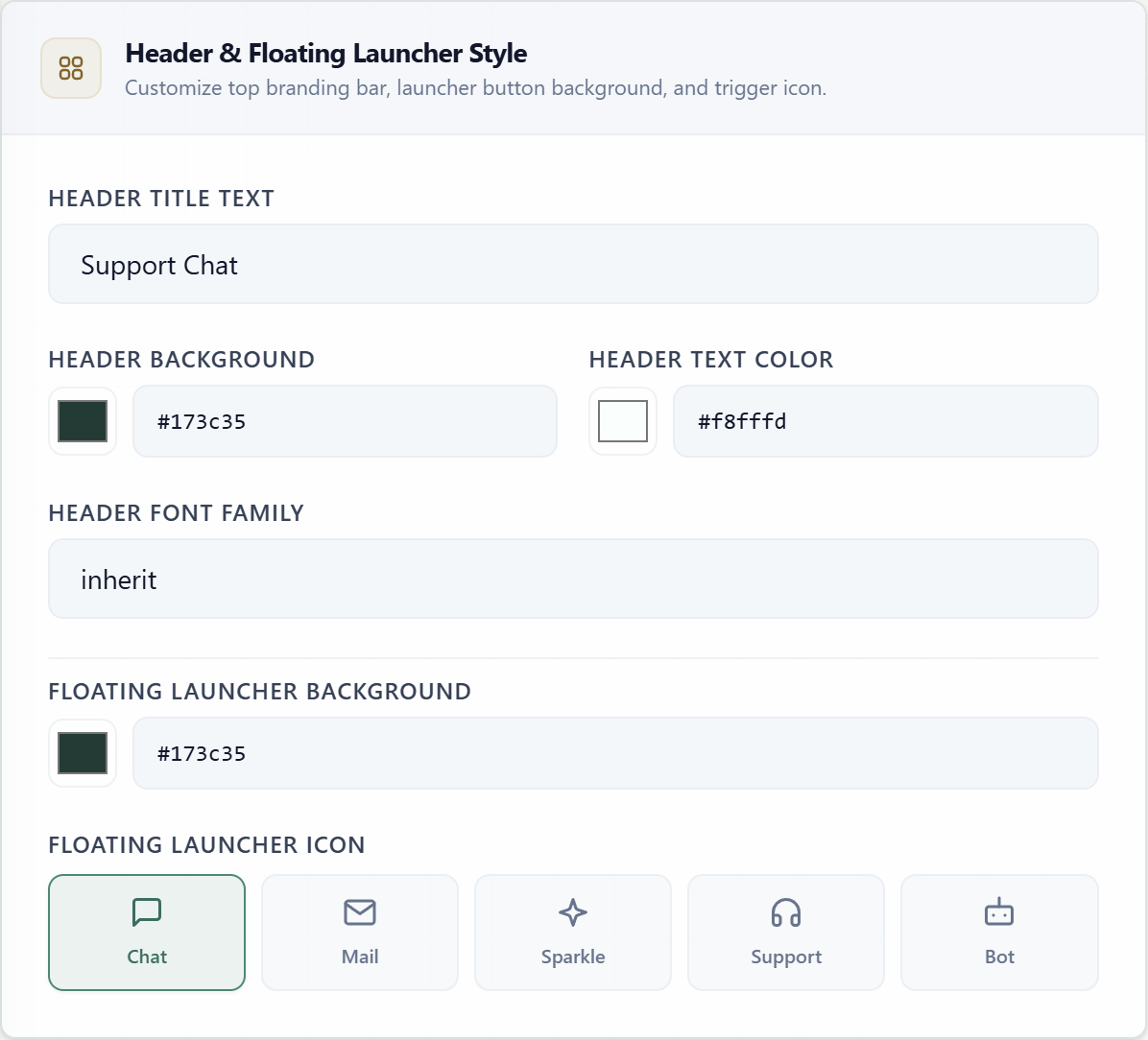
| Field | Default | Purpose |
|---|---|---|
| Header Title Text | Support Chat | Title displayed in the widget header. |
| Header Background | #173c35 | Background color of the top branding bar. |
| Header Text Color | #f8fffd | Color used for header text and controls. |
| Header Font Family | inherit | CSS font family applied to the header. |
| Launcher Background | #173c35 | Background color of the floating trigger button. |
| Launcher Icon | Chat | Symbol displayed inside the floating trigger. |
Section 03
Message Bubbles & Typography
Configure outgoing visitor messages and incoming AI messages independently. Both groups accept the same six CSS-oriented properties.
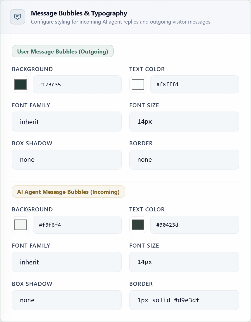
User Messages · Outgoing
- #173c35
- #f8fffd
- inherit
- 14px
- none
- none
AI Messages · Incoming
- #f3f6f4
- #30423d
- inherit
- 14px
- none
- 1px solid #d9e3df
Section 04
Compose Input, Send Button & Actions
Control the message input, send action, surrounding surfaces, and the feedback tools shown beneath AI responses.
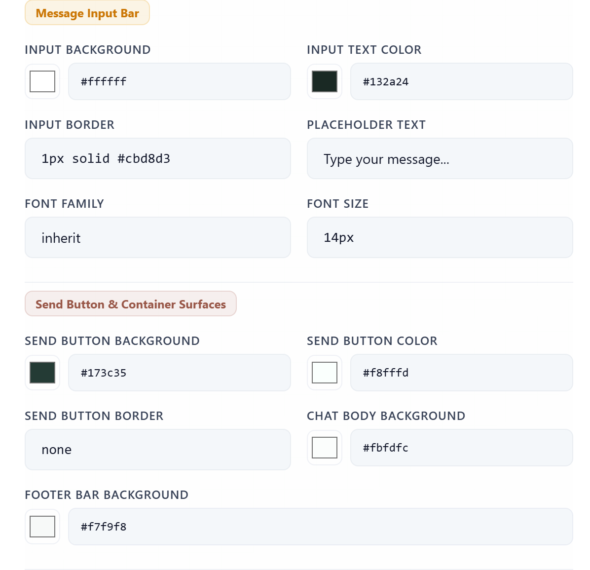
| Field | Default | Purpose |
|---|---|---|
| Input Background | #ffffff | Message compose input surface. |
| Input Text Color | #132a24 | Typed message text color. |
| Input Border | 1px solid #cbd8d3 | CSS border declaration for the compose input. |
| Placeholder Text | Type your message... | Hint shown while the input is empty. |
| Input Font Family | inherit | CSS font family used in the compose input. |
| Input Font Size | 14px | CSS text size used in the compose input. |
| Send Background | #173c35 | Send button background color. |
| Send Color | #f8fffd | Send button icon color. |
| Send Border | none | CSS border declaration for the send button. |
| Chat Background | #fbfdfc | Main conversation surface color. |
| Footer Background | #f7f9f8 | Footer and compose-area surface color. |
Allows visitors to mark an AI response as useful.
Default: OnAllows visitors to flag an unsatisfactory response.
Default: OnCopies the response content to the clipboard.
Default: OnRequests another generation for the same visitor message.
Default: OnLive feedback
Preview & Security Summary
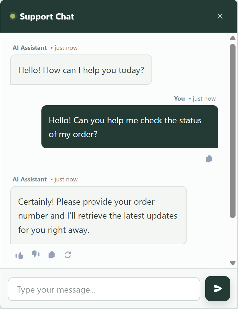
The right column previews a complete conversation, response actions, compose bar, and floating launcher. The summary below tracks the selected target, allowed origins, and icon.
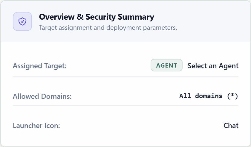
An empty Allowed Security Domains value permits every origin. For production, list only the hostnames that should initialize and communicate with this widget.
Required before save
Widget name, target type, and one resource selected for that target type.
After creation
Use the saved widget configuration and its generated embed details to install the launcher on an allowed website.